sussland.com

art

  • Projects
  • CV
  • Contact
  • Blog

Interference Gold

July 30, 2018 By Karolina Sussland

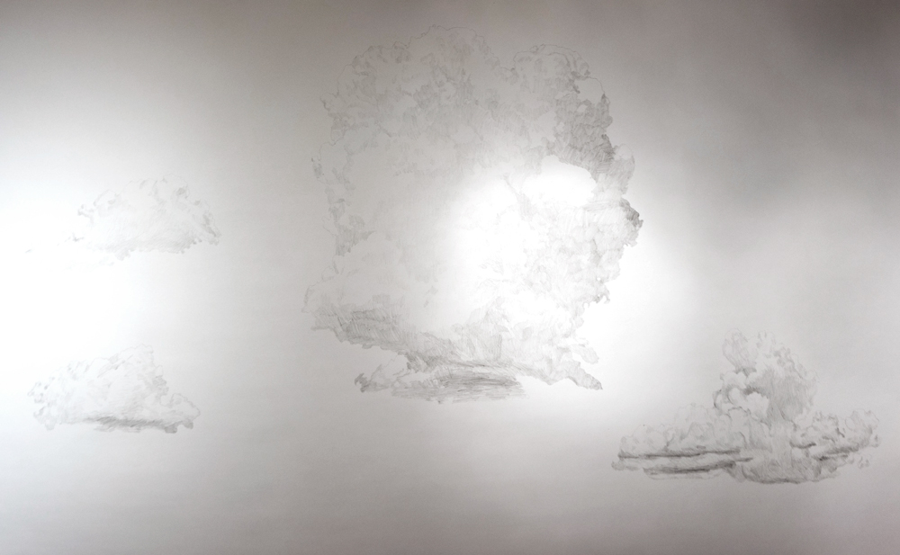
I thought I’d write a little about interference gold. I get a lot of questions about it. It’s an amazing and sexy color, like all the interference colors. You can see it as both the color named as well as it’s complement. With interference gold, it’s the gold, and its complement purple. “These colors are derived from mica platelets. They are then coated with an extremely thin layer of titanium dioxide. Refraction and reflection of light at the titanium dioxide layers produces various colors and pearlescent effects.” – Golden. This is the clearest example of 2 interference colors that I have used in one painting where you can see the effects. It’s from an older unfinished white sunset painting:

See how the color changes from top to bottom? The stripes are obvious between the interference gold paint and the interference blue paint. The gold’s complement is more purple, the blue’s compliment is more orange. This is all because of the tiny titanium coated mica flakes that are in the paint. The goal when using these colors is to get the flakes to lay flat, so they can reflect as much light as possible. To do this the layers have to be incredibly thin. In this painting, I have at least 10 layers per color. I don’t count, I judge it by appearance, by how well I can see the drawing underneath. If the drawing is no longer visible at some angle then I’m ready to move on.

The Phenomenon of Light Interference from the Golden website:

“The property at work in the Interference Colors is known as light interference, most commonly seen in the rainbow effect created by a thin layer of oil on the surface of water. Thomas Young identified this phenomenon in 1801 in a series of investigations that were eventually instrumental in advancing the theory for the wave-like nature of light. Whenever light strikes a boundary between two materials of different densities, the light will either be reflected or refracted. If the refracted light encounters yet another boundary between materials of different densities, this light will again either be reflected or refracted. This process continues every time a new phase is encountered.

Light interference results from these concurrent multiple reflections and refractions of light. If the interference is constructive in nature, a strong color stimulus results. With Interference colors, a specific thickness of the titanium dioxide (TiO2) layer allows only a narrow spectrum of color to be reflected in phase, while all other reflected colors undergo destructive interference and are not observed. Since these pigments are transparent, a portion of the light will be transmitted and the resulting color will appear as the compliment to the reflected color.”

More from Optics 4 Kids (it’s a great explanation):

“In the following figure, a ray is incident on an interface between two dissimilar media. A plane that includes the incident ray and a line drawn normal to the surface is called the plane of incidence. This plane also contains the reflected and refracted rays. A refracted ray is transmitted into the second medium and travels in a different direction than the incident ray. The angle that the incident, reflected, and refracted rays make with the surface normal are called the angles of incidence, qi , reflection, qr, and refraction, qt, respectively. The refractive index of medium 1 is n1 and of medium 2 is n2.

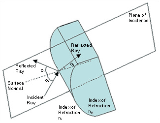
Illustration of incident, reflected, and refracted rays.


Interference colors are different from the markings on US money bills which have to be applied with fancy tech that modern material physicists came up with, as I was told at an art opening by a material physicist. I couldn’t answer his questions, so I had to look this all up. He had great questions, turns out there are about no similarities. This will be in my next post as I don’t have a dollar bill to look at right now. It’s late at night. I have insomnia and sometimes I deal with it by writing or working. Might as well, right?

Filed Under: Uncategorized

The Promiscuity of Digital Data

May 3, 2017 By Karolina Sussland

Do not fear historians of 2003

Evil Bert will always be remembered.
Scarcity or Abundance? Preserving the Past in a Digital Era

Filed Under: Uncategorized

The Adventures of Spray Bottle(x2), Mallet, and the Babies

April 27, 2017 By Karolina Sussland

Watch the story slowly unfold on Instagram.
It all began in Argleton.
My Instagram 

A post shared by Karolina V Sussland (@kvs3333) on Apr 26, 2017 at 3:37pm PDT


Filed Under: Uncategorized

Unmasking Identity

April 21, 2017 By Karolina Sussland

Dates

4/21 2017 – 5/14 2017
Reception: 4/21 2017  6PM – 10PM

Location

Phoenix Institute of Contemporary Art
Roosevelt Street
Phoenix, Arizona 85004
United States

Details

Please join Faith Damm and Alexis Marie Sheets for the opening of their curatorial debut, “Unmasking Identity.” Hosted by Phoenix Institute of Contemporary Art (phICA) and made possible by Ted G. Decker.

Artists shown:
Malena Barnhart
Constance McBride
Christian Stewart
Karolina Sussland
Kays Willbur

“Merging two curatorial personalities and delving into the identities of the artists, “Unmasking Identity,” boldly examines and questions the fine line between the superficial and inner self.

Art has historically been used as a way to express emotions lurking beneath the surface; a sort of safe space to convey the divergence between our inner and outer selves. Almost every artist struggles with developing a boundary-pushing identity while also attempting to appear palatable to both intellectual and superficial scrutiny. Unmasking Identity features the work of artists Malena Barnhart, Constance McBride, and Karolina Sussland as well as the work of art students Christian Stewart and Kayla Wilbur. These artists offer a unique and varied perspective on identity from a direct interpretation of the inner-self by artist Kayla Wilbur to a more social context represented by Malena Barnhart. All artists featured display not only a strong personal artistic vision, but also create work that speaks on a larger note about identity in relation to the world around us.

First impressions are everything, yet they rarely match a person’s true identity. We are living in a superficially obsessed culture that is bombarded by over-saturation. People create artificial identities and images that are readily available for immediate and constant consumption. Almost everyone is desperately trying to establish a distinctive persona that fosters both individualism and some degree of cultural, political, and societal inclusiveness. How, then, does one wade through this overabundance of manufactured personalities and discover what truly lies beneath?”

For more information on phICA, Emerging Curators Initiative, or Faith Damm and Alexis Sheet’s show, “Unmasking Identity,” please visit:

http://phica.org/phica-emerging-curators-inititative/phica-emerging-curators-initiative-season-2/faith-damm-alexis-sheets/

Filed Under: Uncategorized

Onloaded: Karolina Sussland/Clouds

April 14, 2016 By Karolina Sussland

I’m excited to be part of the season closing show at PhICA! Curated by Ted Decker
http://phica.org/projects/onloaded-3/karolina-sussland/

Here are some pics, they’re a little blurry. Better pics are on the way

Clouds7-web

Clouds4-web

Clouds2-web

Filed Under: Uncategorized

More from the sunset series

November 28, 2015 By Karolina Sussland

These are all inkjet and graphite on paper, 2015

Sunset12-10x8 Sunset11-16x11 Sunset10-11x8 Sunset9-25x19 Sunset7-16.5x12.5 Sunset5-15x10 Sunset4-19x14

Filed Under: Uncategorized

New Times Write Up

October 21, 2015 By Karolina Sussland

I have a show up at the Eric Fischl Gallery at Phoenix College titled “Karolina Sussland: Big A, little a”
Tear down is October 27th. It’s the first of a 3 part series at Phoenix College. Mary Lucking is next in February. That should be a good show too.

Here’s a write up by Brittany Corrales:

http://www.phoenixnewtimes.com/arts/at-phoenix-college-karolina-sussland-asks-what-distinguishes-fine-art-from-commercial-art-7737755

Filed Under: Uncategorized

in the studio

July 21, 2015 By Karolina Sussland

I’ve been asked about the process of painting this series, so here’s a picture from my studio of one in progress. Obviously this one will have stripes. The paint you see immediately below is interference gold. It’s high tech as far as paint goes because it has tiny titanium dioxide coated mica flakes in it, which is also what makes it hard to use. The flakes need to lay flat so that they reflect the maximum amount of light. This is done by painting in very very thin layers. Lots of them.

SunsetInTheStudio

UPDATE: Below the stripes of interference gold and interference blue are finished. I took a pic because the flip of the color to its complement was obvious with my studio lighting and it’s usually difficult to capture in a still shot.

stripes-m

The rest of the process should be obvious.

Filed Under: Uncategorized

Ocean Love

November 23, 2014 By Karolina Sussland

ocean love from Karolina Sussland on Vimeo.

Filed Under: Uncategorized

Under Construction

August 10, 2014 By Karolina Sussland Leave a Comment

This site is under construction. Please come back in a few days.

Contact admin@sussland.com with any inquiries

Thanks for your patience!!

Filed Under: Uncategorized

  • 1
  • 2
  • 3
  • …
  • 5
  • Next Page »

Copyright © 2023 · Foodie Child Theme on Genesis Framework · WordPress · Log in